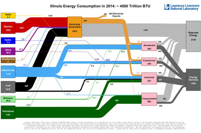
The Lawrence Livermore National Laboratory, under the direction of the U.S. Department of Energy and using data from the Energy Information Administration, has produced flow charts showing the major sources and uses of energy in every U.S. state in the year 2014.
Energy flows from the sources (left) through the various uses (middle). On the right side of each chart, energy from each use is divided into energy services (used energy) and rejected energy (wasted/unused energy), indicating the efficiencies of each energy use. The thickness of each line is proportional to the amount of energy. In addition to flow charts for each state, an overall flow chart for the United States is also available for multiple years.
Click here to access the energy use flow charts.

