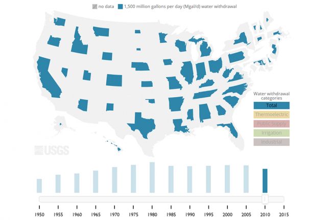
The U.S. Geological Survey has produced a visualization that shows how much freshwater is used by each state for a variety of purposes. The visualization resizes the states according to how much freshwater they use.
The visualization shows freshwater withdrawals for thermoelectric power generation, public supply, irrigation, industrial use, or total withdrawals, with data available in 5-year intervals from 1950 to the present.
Click here to access the visualization of state water use.
Source: U.S. Geological Survey

